Work
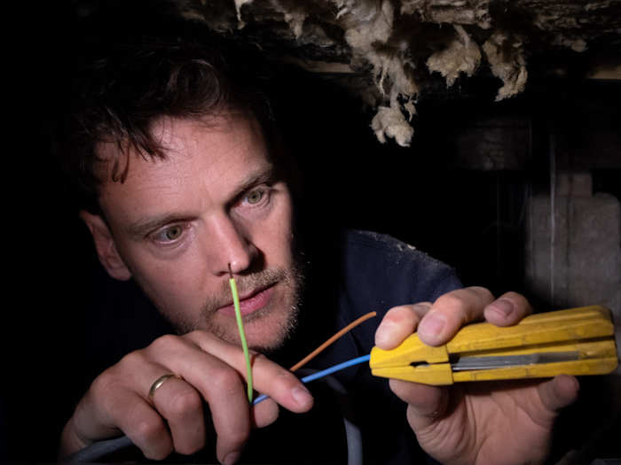
I'll go over this one fast, as my battery's running out. Vincent van der Werf asked us to help him out creating a powerful digital presence. We create a small scalable identity system and website that helped him jump up in search results. Electrifying.
I mean, sorry. He’s an electrician. We had to do our take on the lightning bolt.
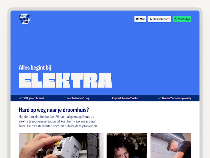
Make the logo bigger? 🤨 Make the tagline bigger.

Make due with what you have, for example: no time, no budget, yes camera, yes Vincent himself.
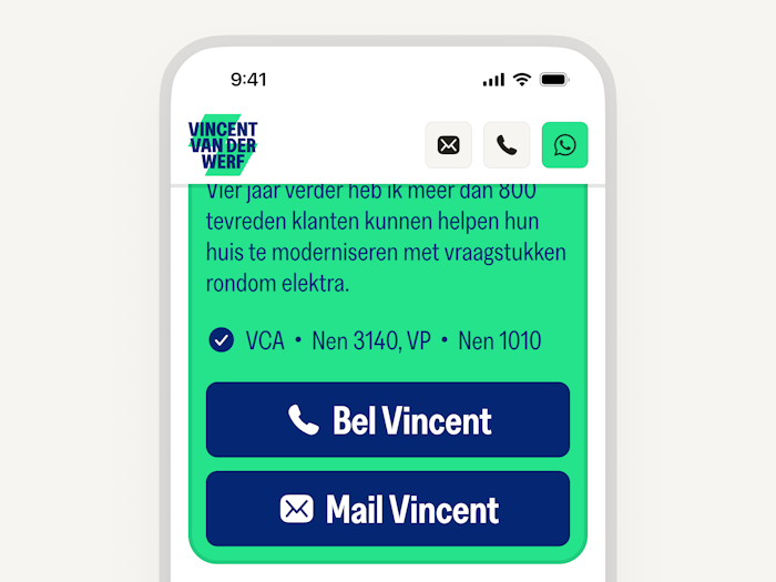
Who’s complaining about a couple of big, fat, chunky CTA’s? Exactly. No one.
Core team
Jori Regter
Martijn van de Zuidwind
Design
Prototyping
Iconography
Accessibility
Visual design
Design system
Identity design
Marketing strategy consultation
Interaction concepts & design
Content
Copywriting
Photography
Strategy
Brand strategy
Marketing strategy
Links
Parta

Currently working on — We make better decisions together.
Vincent van der Werf

2024 – Everything starts with electricity
Klif
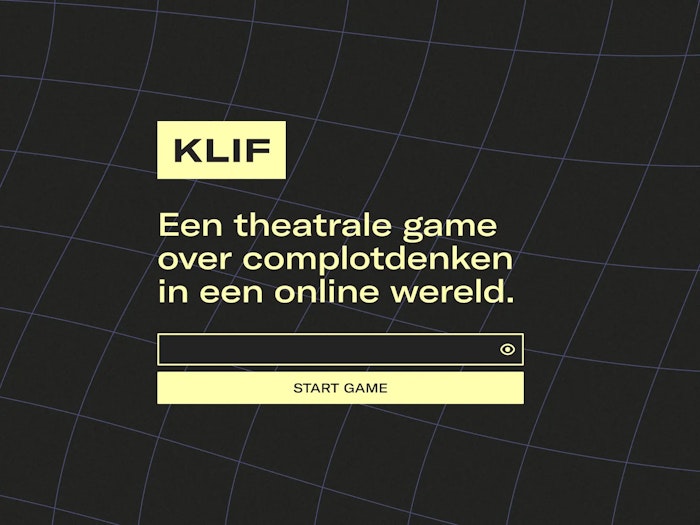
2021 — A serious game about conspiracy thinking and online misinformation.
RUFF
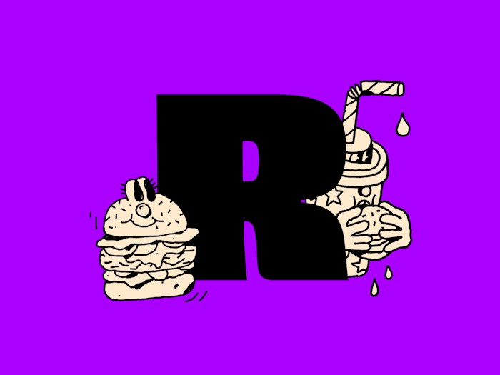
2021 — Vegan Burger Fun, delivered.
Studio Natuurlijk
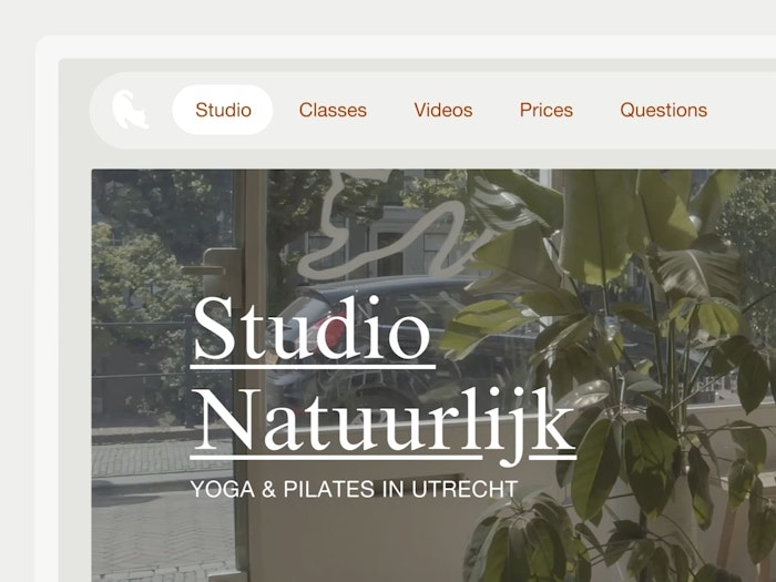
2019 — Take a chill pill. Or follow proper yoga classes. I’d go for the second option.
Go Short
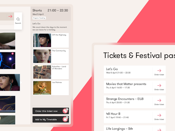
2017 — Finding structure in a festival line-up comprised of 264 films.
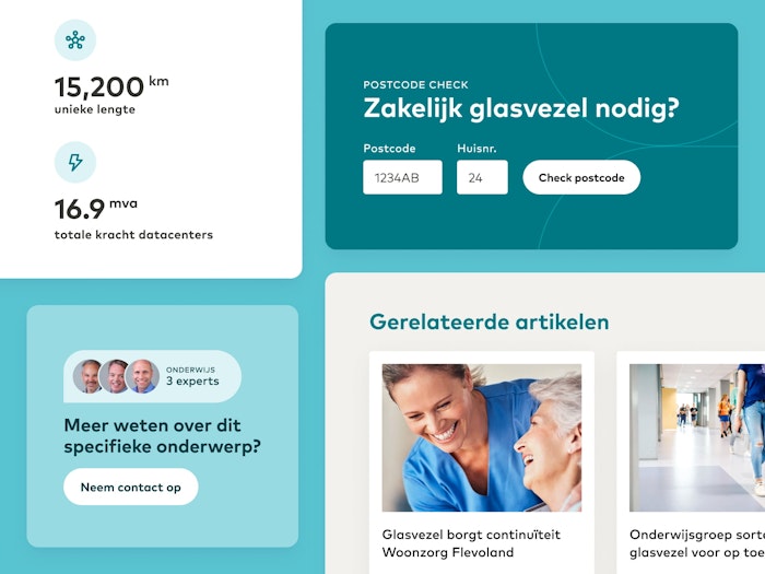
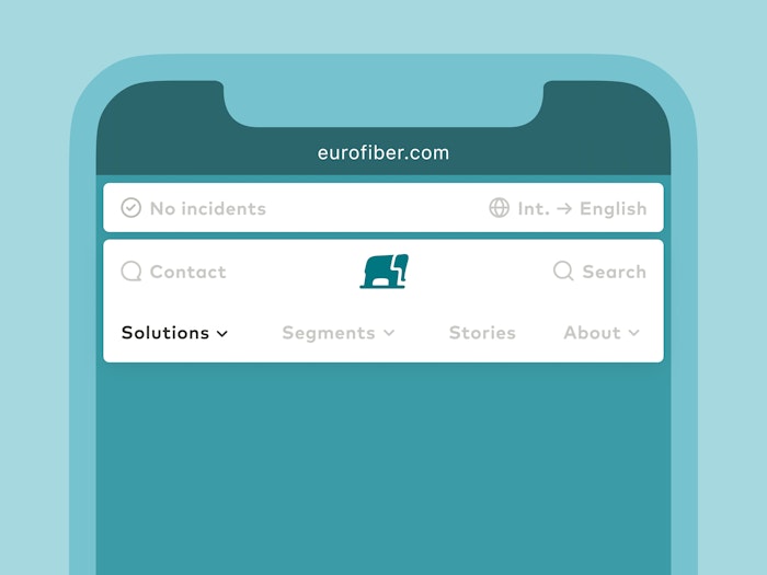
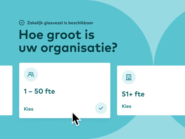
Eurofiber – 2021
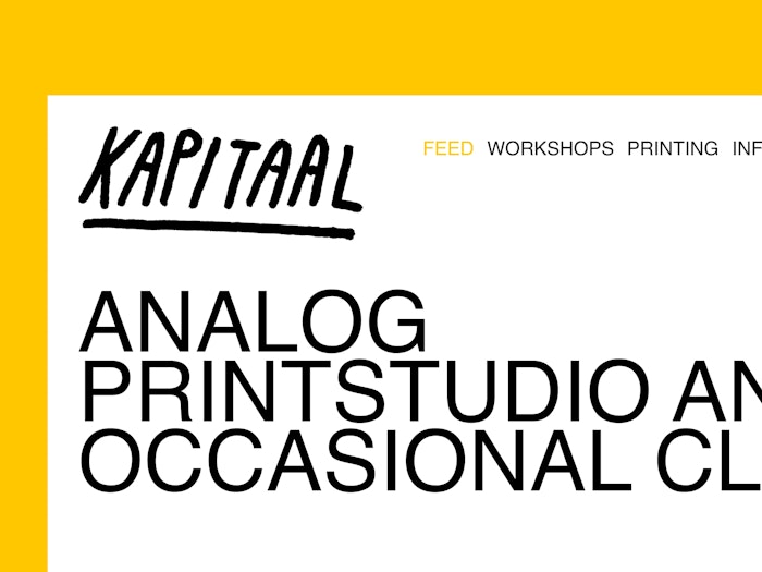
Kapitaal — 2020
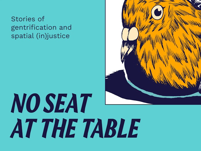
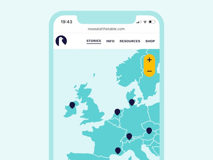
No Seat at the table — 2020
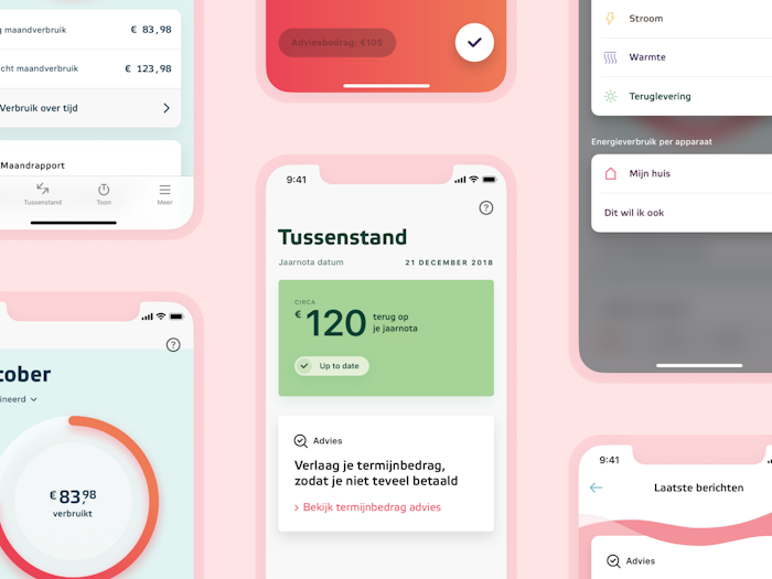
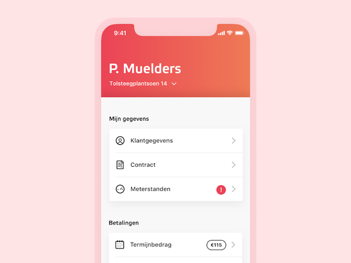
Eneco — 2018
HR Projectadvies — 2018
Info
I'm Martijn, a digital designer from Utrecht (NL) with 10+ years of professional experience.
While I focus on tinkering with interfaces and designing for curiosity, I appreciate being involved in branding as well.
I like to think about friction in interaction design.
Technology is an instrument meant to help us, which means it shouldn’t intrude when we don’t need it. By thoughtfully adding small amounts of friction to well-considered places, I believe that we can strike the right balance between maximising usability and maintaining an appropriate distance.
Another way I’d like to look at design is that it is a way of making the technology we use feel considerate, warm and natural. While this isn’t technology’s default state, I believe that we should use design to give us back some of that warmth.
This means we should be focused on anticipating and solving a user’s problems before they ever have them. Ideally, a tool should be so intuitive and caring that we forget that it’s technology at all. It should just be there when it’s needed, and absent when it’s not.
Currently
Digital product designer at Parta – a method & platform for decision-making processes
Freelance designer – helping out friends, design studios and organisations
Guest lecturer at Utrecht University of Applied Sciences – Communication and Media Design
Previously
Lecturer at Utrecht University of Applied Sciences – Communication and Media Design's specialisation 'Human Centered Design'
Digital designer at iO
UX designer at Hike One
UX designer through secondment at SchaalX
Designer at Studio Airport
Collaboration is essential to create relevant work. In my freelance practice, I experiment with different approaches of collaboration, be it with clients, specialists in related fields and designers new to the game.
I’ve developed a strong interest in socially driven projects by being involved in ones such as restaurant Syr and Parta. It's also why I started lecturing at Communication & Multimedia Design in Utrecht. Are you working on a socially driven project? I’m always open to learn more. ☻
Some clients I worked for
University of the Arts Utrecht
Dutch Ministry of Culture, Education and Science
Into the Great Wide Open
Amsterdam Art Council
Sportbedrijf Rotterdam
Emergence Magazine
White Ribbon UK
Restaurant Syr
Zware Jongens
Greenpeace
Kapitaal
Pfizer
eBay
Main skills
Interaction design
Digital branding
Visual design
Also fine at
Concept development
Project management
Design education
Usability testing
Design Thinking
Design systems
Workshopping
User research
Iconography
Prototyping
UX writing
Kanban
Scrum
Agile
GTD
I play around in
Final Cut Pro X
Affinity’s suite
Adobe’s suite
Keynote
Sketch
Things
Notion
Figma
Miro
Jira
Office (with a face like this: 😤)
Mentions
It's Nice That – Tom Heerschop
Commarts – Tom Heerschop
Volkskrant – Syr
DUIC – Syr
NU – Syr
European Design Award – Amsterdamse Kunstraad
Honorable Mention – Amsterdamse Kunstraad
Honorable Mention – Tom Heerschop
Honorable Mention – Go Short
Honorable Mention – Inspire
DesignRush – Ruff
For inquiries
If you’re into PDFs
Development by
Eurico Sá Fernandes and Jori Regter
Shout out to
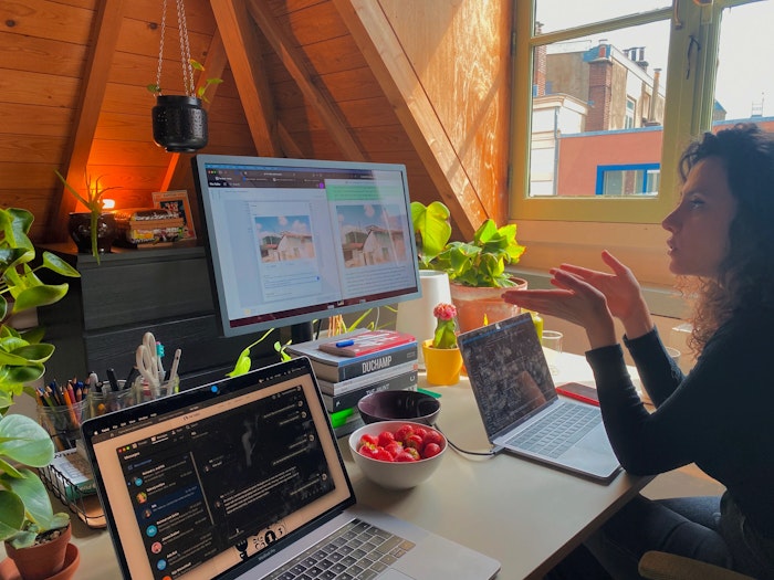
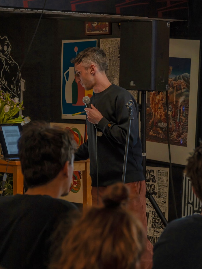
Nikita Kuijpers. She shot the photo of me giving a talk.
- A designer
- doing sites,
- apps & such
